Book Cover Design
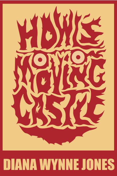
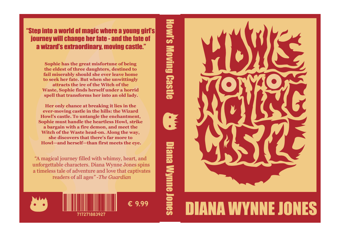
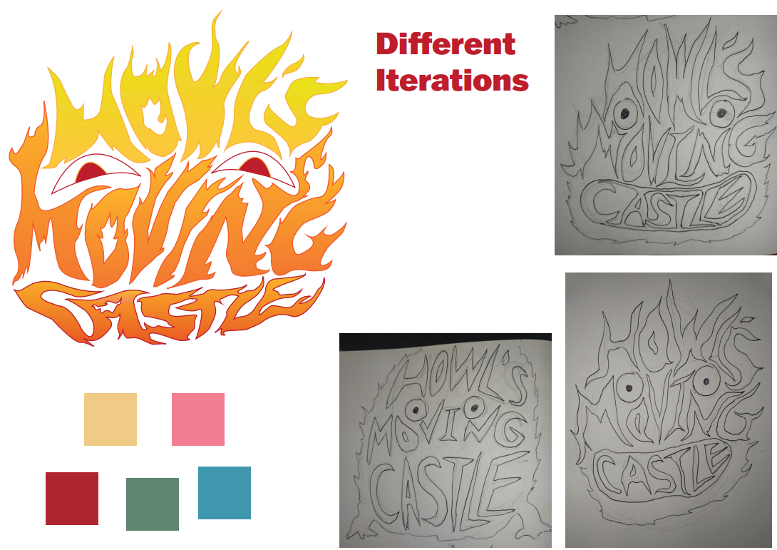
A full dust jacket for Howl’s Moving Castle, drawn with nothing but type: the title lettered into the shape of the fire demon at the heart of the story.
- Role
- Lead designer
- Timeline
- 2024
- Tools
- Illustrator, Photoshop
- Type
- Student brief
The brief
Design a book cover using only typography. No illustration, no photography. Whatever the cover had to say about the story, the letterforms had to say on their own. I took Howl’s Moving Castle, researched the visual side of the book, worked through several concepts, and ended up with a jacket where the title carries the imagery.
The challenge
The hard part was finding a visual aspect of the book that could be turned into typography without compromising the book’s character. Everything else followed from that: which colour palette to use, which visual decisions to make, and how to represent imagery through type alone.
How I got there
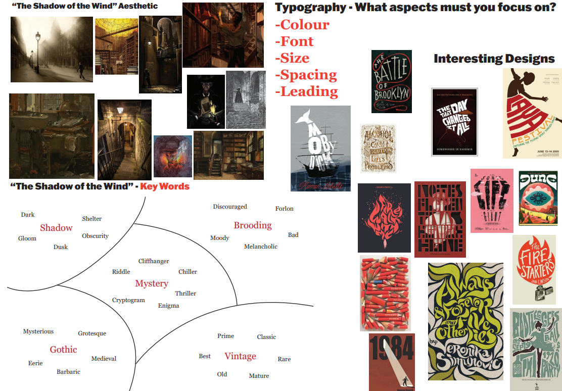
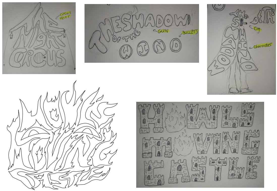
Discovery and concept meant researching existing book covers and the elements of the story, picking out the visual aspects worth keeping, settling on a palette and exploring what typography could be made to do. The sketches went wide before they went deep. They covered other titles, and two different directions for this one: the title built out of castle towers, and the title built out of flame. Refinement took feedback from lectures and from peers and narrowed it down to the final design.
The design
The finished cover reads the title as Calcifer: the words Howl’s Moving Castle are drawn as a burning shape with two eyes cut into it, so the lettering is the character. Red on cream keeps it to two colours across the whole jacket, and the same flame ties the three panels together: ghosted behind the blurb on the back, and reduced to a small Calcifer face on the spine and in the corner of the back cover.