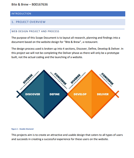
This project was focused on the whole process of creating a design for a client.
Starting with basic research, moving onto wireframe designs into finished figma interacive prototypes. I crafted a brand for this client and created designs from my own research done.
The Challenge
The challenge came in making this made-up client a design that was realistic in terms of what a client would want to have. This specific aspect also then affected the research as I needed to do market research and target the key users of the establishment to create the app around them and their possible usability.
Key Challenges
Standing out in a saturated market, appealing to both technical and non-technical audiences, and creating a design from scratch.
Through extensive research, I identified the core values that would control every design decision moving forward.
Design Process

Research & Discovery
I began with comprehensive market research and research into their competitors to highlight the ket points that consumers of this area of business are drawn to.
Concept Development
- Created multiple logo concepts exploring different visual directions
- Developed color palette options based on brand values
- Explored typography that balances modernity with readability
- Tested concepts with target audience for feedback
Refinement & Execution
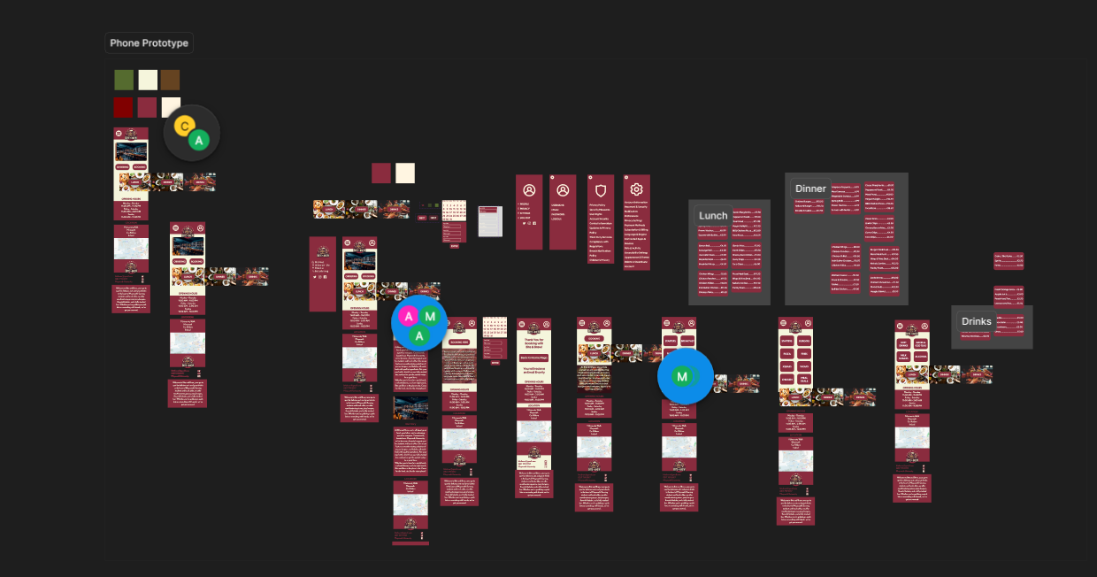
After selecting the strongest direction, I refined my plan into an initial wireframe design. Testing this on target audiences I was quickly able to eliminate flaws and begin crafting the final version.
The Solution
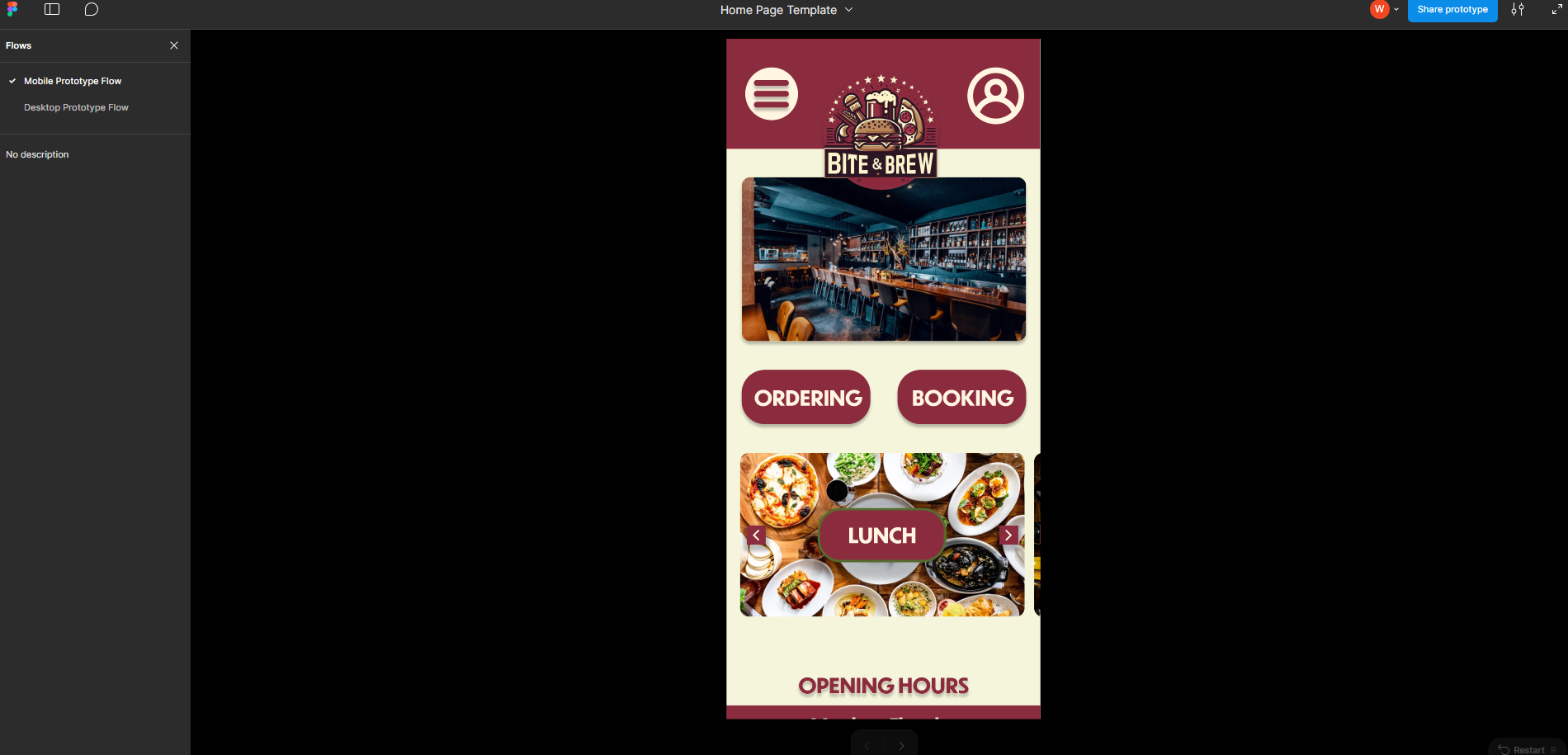
The final brand identity features a bold, Striking logo. The color palette combines deep maroon reds with creme accent colors, creating a up beat feel for the user.
Design System Highlights
Great usability with button feedback and contrasting colours, smooth animations when interacting with the buttons, and a easily used carousel to take you to where you need to be.