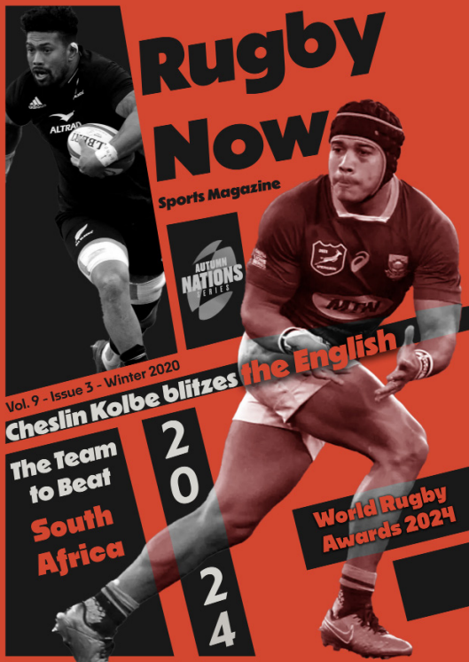
Rugby Now Magazine
My own take on a rugby magazine: a cover and a layout system for a sports publication, built around bold type and a palette of deep orange and black.
- Role
- Lead designer
- Timeline
- 2025
- Tools
- Illustrator, InDesign
- Type
- Student brief
The brief
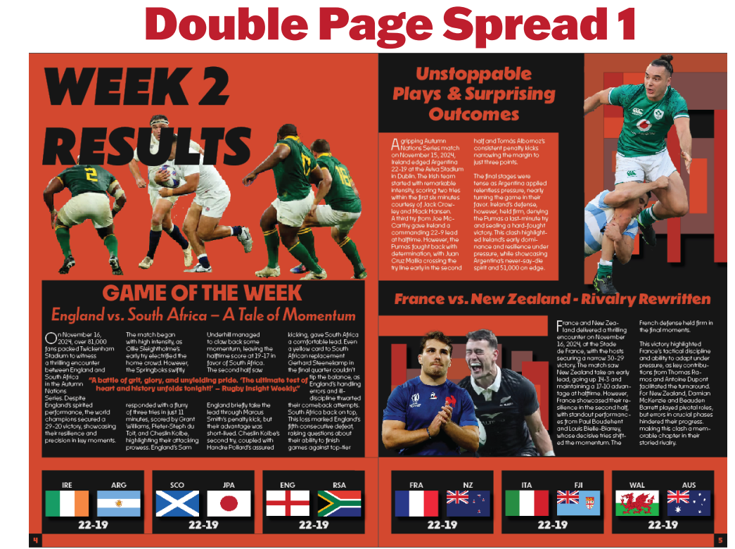
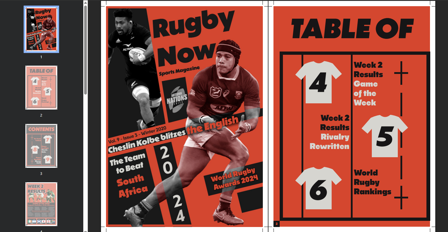
Research and build a sports magazine from the ground up: a cover, a contents page and a set of inside spreads for a rugby title. The work ran from foundational research through conceptual designs to refined final layouts, with the balance between visual and textual elements as the thing to get right.
The challenge
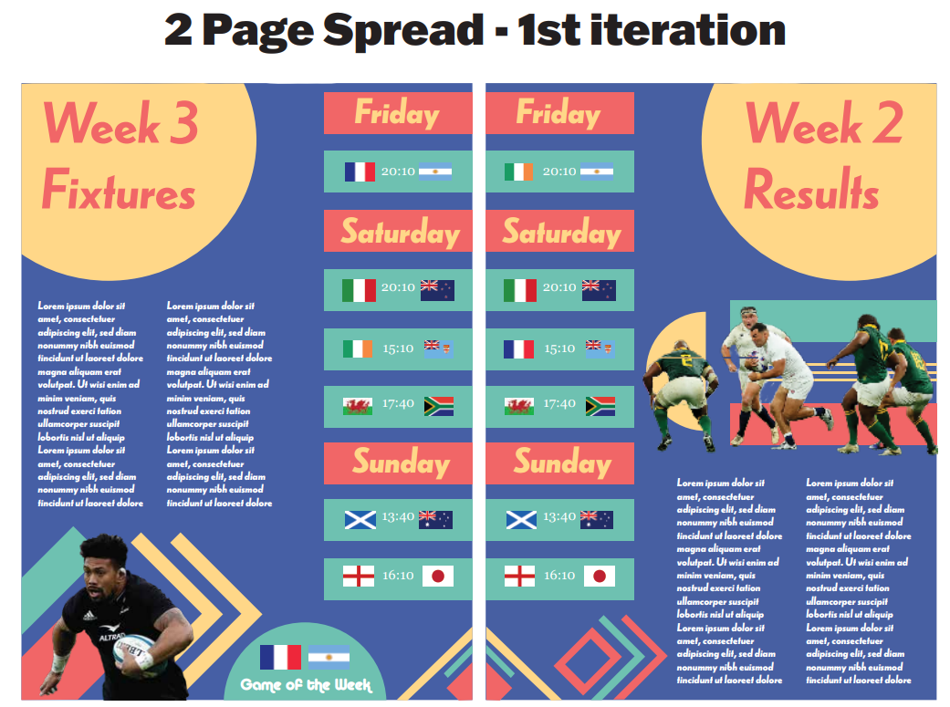
The obstacles were colour themes, the amount of text, the spacing between images, text and dead space, and how the images were used. Managing the palette, the typographic hierarchy and the distribution across the page was genuinely difficult in the early iterations. The first spread used a blue, yellow and teal scheme that fought the photography instead of carrying it.
How I got there
Research and discovery meant competitive analysis and market research into magazine industry standards and what a rugby audience actually wants. Concept development ran through several iterations with different colour palettes and typography, tested against that audience. Refinement was a matter of picking the strongest direction out of the feedback and taking it all the way.
The design
The final cover is deliberately loud: a colour scheme of deep oranges against darker tones to read as premium rather than cheap, cut out players breaking across the masthead, and angled type carrying the headlines. The same system runs inside: the orange and black carry through to the spreads, and the scorelines sit in a strip along the foot of the page so the results are readable at a glance.